Old Mutual Website Redesign
2019
Client
Old Mutual
Project at a glance
Role: UX content and design
Platform: Old Mutual public-facing website
Focus: Simplifying complex financial journeys, improving information architecture and strengthening decision-making support
Scope: End-to-end journeys across Personal and Wealth
Overview
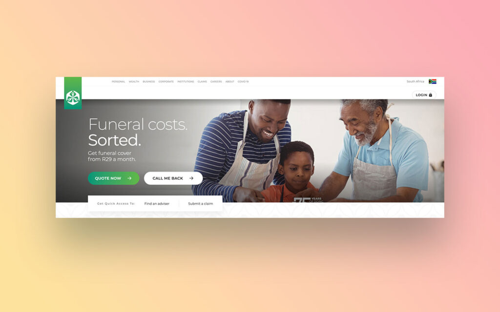
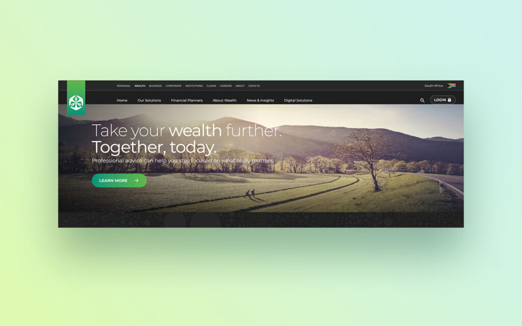
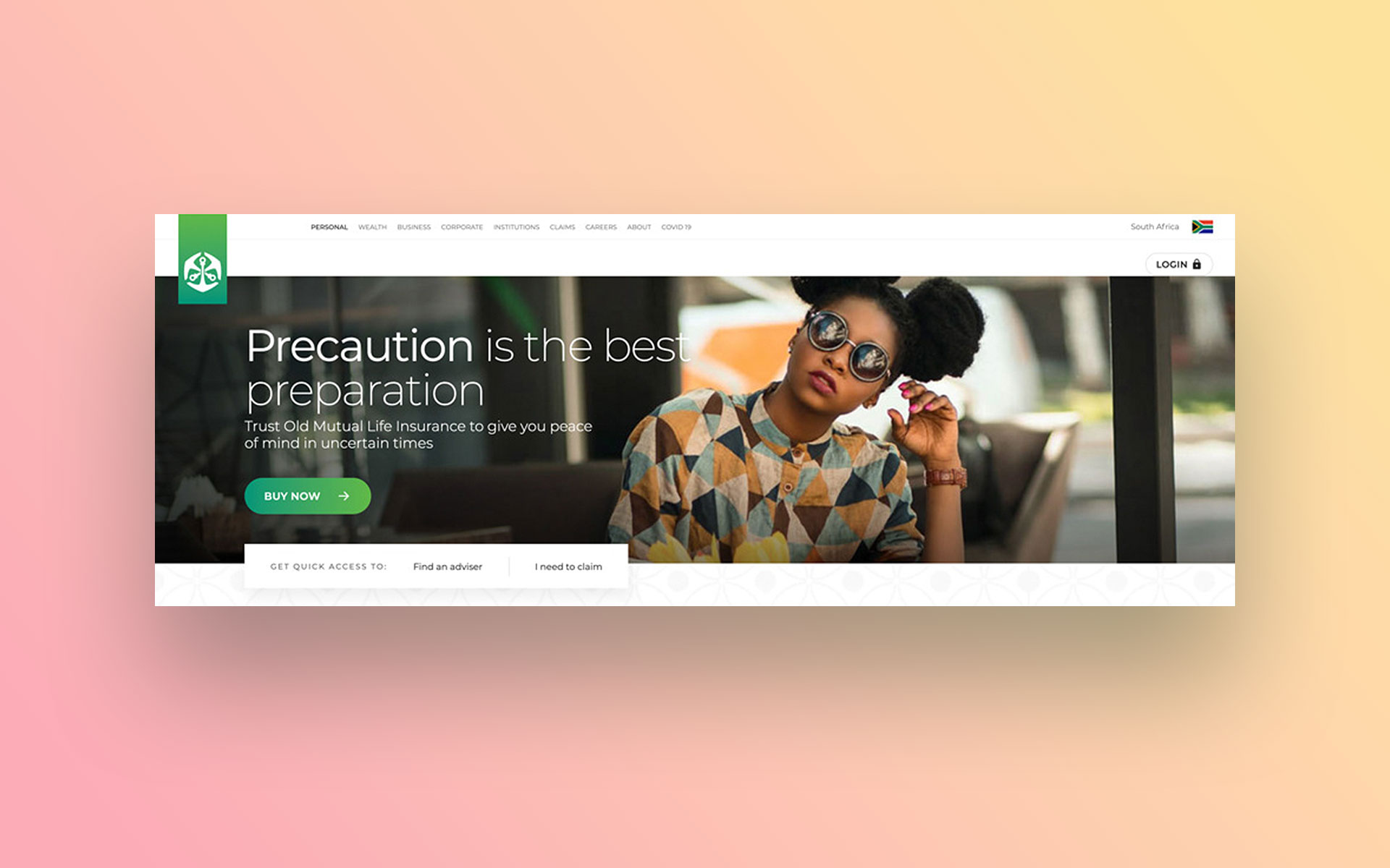
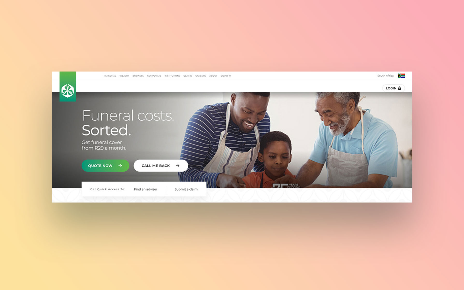
Old Mutual offers a wide range of financial solutions across personal, wealth and business needs. I worked on the website redesign to make these offerings easier to understand, easier to navigate and more aligned to how users think about their financial decisions.

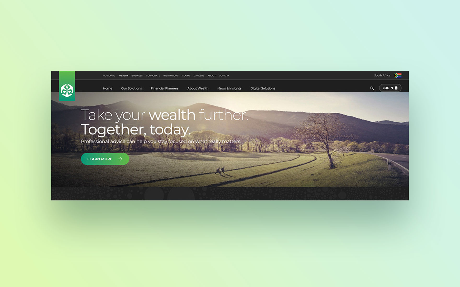
The Challenge
- Content and structure were largely organised around internal product groupings, making it difficult for users to find relevant solutions.
- Journeys across Personal, Wealth and Business were fragmented, with limited continuity between related experiences.
- Financial products were often explained using dense, jargon-heavy content that made comparison and evaluation difficult.
- Users were not consistently guided through key journeys, with limited clarity on next steps, outcomes or progression.
My Role
- Wrote messaging and interaction-level content across key journeys.
- Reframed product-led content to align with user needs, goals and decision-making.
- Improved clarity and guidance to support usability and progression.
- Collaborated with designers and stakeholders to align content with interaction and visual design.
Approach
- Audited the existing experience through content reviews, journey analysis and stakeholder engagement.
- Shifted the structure from product-led to user-centred, aligning content to life stages, financial goals and decision points.
- Simplified complex financial content to reduce cognitive load and improve scanability.
Strengthened continuity between web and app journeys to support seamless movement from exploration to action. - Focused content on guiding users clearly through key tasks, decisions and next steps.
Strategic Decisions
Reframed the experience around user needs
Repositioned products and services around user goals and financial decisions rather than internal structures.
Simplified complex financial content
Reduced jargon, clarified terminology and structured content to support scanning and comprehension.
Strengthened guidance across journeys
Made next steps, actions and outcomes clearer at key points to support progression and reduce uncertainty.
Introduced interaction-level content patterns
Embedded contextual guidance within flows to support decision-making and reduce friction at critical moments.
Improved cross-channel continuity
Aligned messaging and journeys across web and app to create a more consistent and connected experience.
Aligned content to UI and design systems
Ensured content worked effectively within components and patterns to support consistency and scalability.
The Outcome
The redesign created a clearer, more user-centred and more connected digital experience for Old Mutual.
- Users could more easily understand and navigate financial products aligned to their needs and goals.
- Content became more scannable, accessible and easier to act on.
- Journeys across Personal and Wealth were more cohesive and better supported decision-making.
The experience created stronger continuity between web and app interactions.
Reflection
This project reinforced the importance of structuring content around how people make decisions, not how products are organised. In complex financial environments, clarity comes from aligning content, structure and interaction to support progression, confidence and action.
Explore More Work
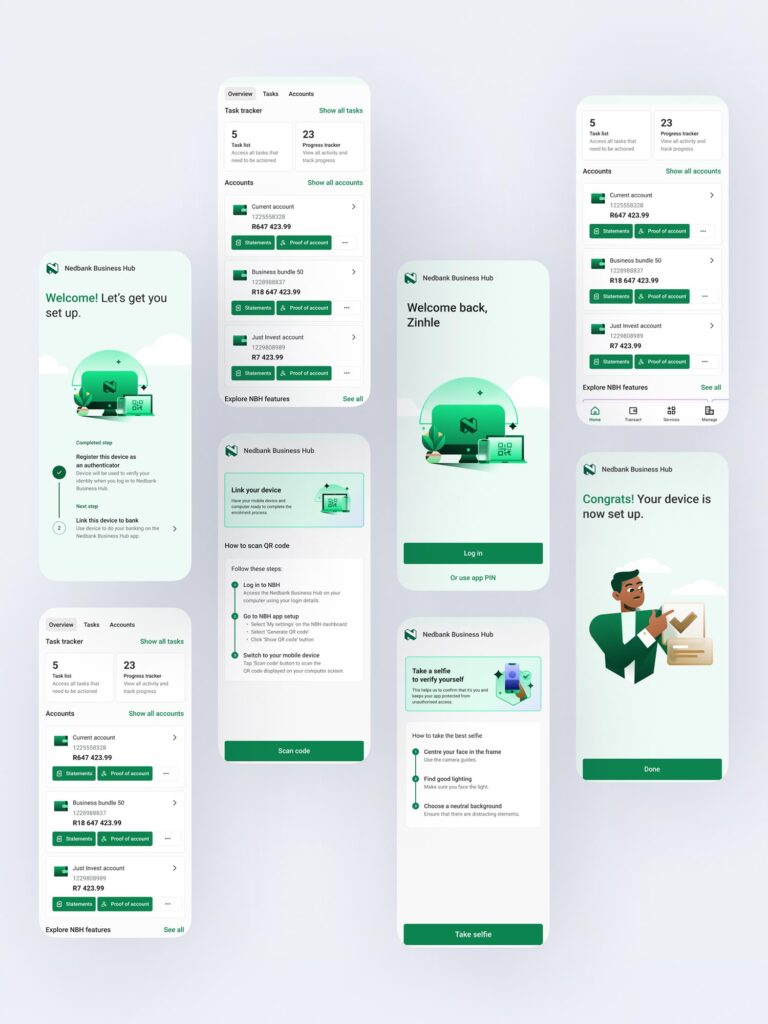
Nedbank Business Hub App
Nedbank Business Hub App

Nedbank API Marketplace
Nedbank API Marketplace
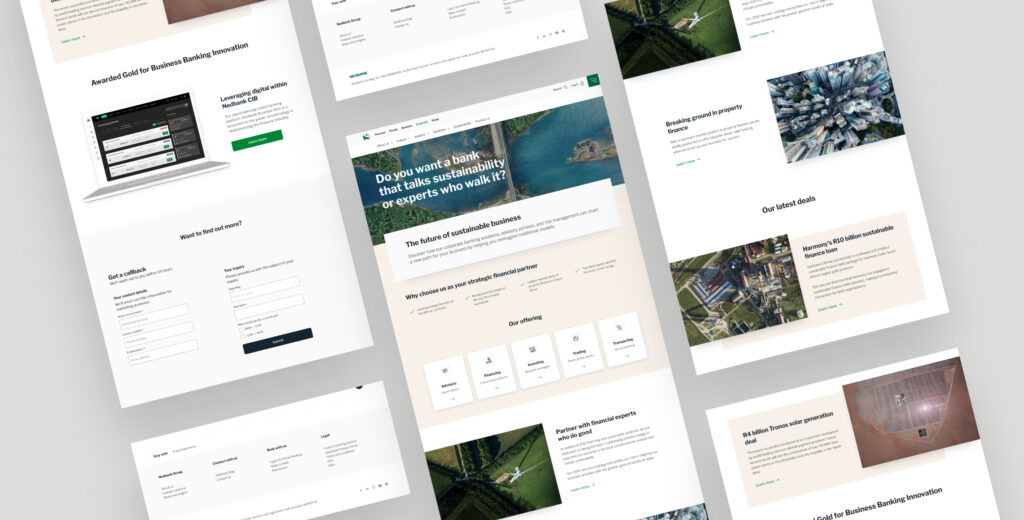
Nedbank CIB MVP
Nedbank CIB MVP
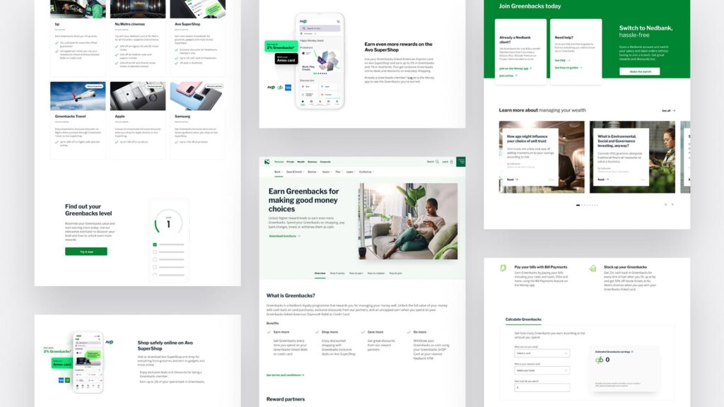
Nedbank Greenbacks Rewards 2.0
Nedbank Greenbacks Rewards 2.0

Nedbank Reimagine MVPs
Nedbank Reimagine MVPs
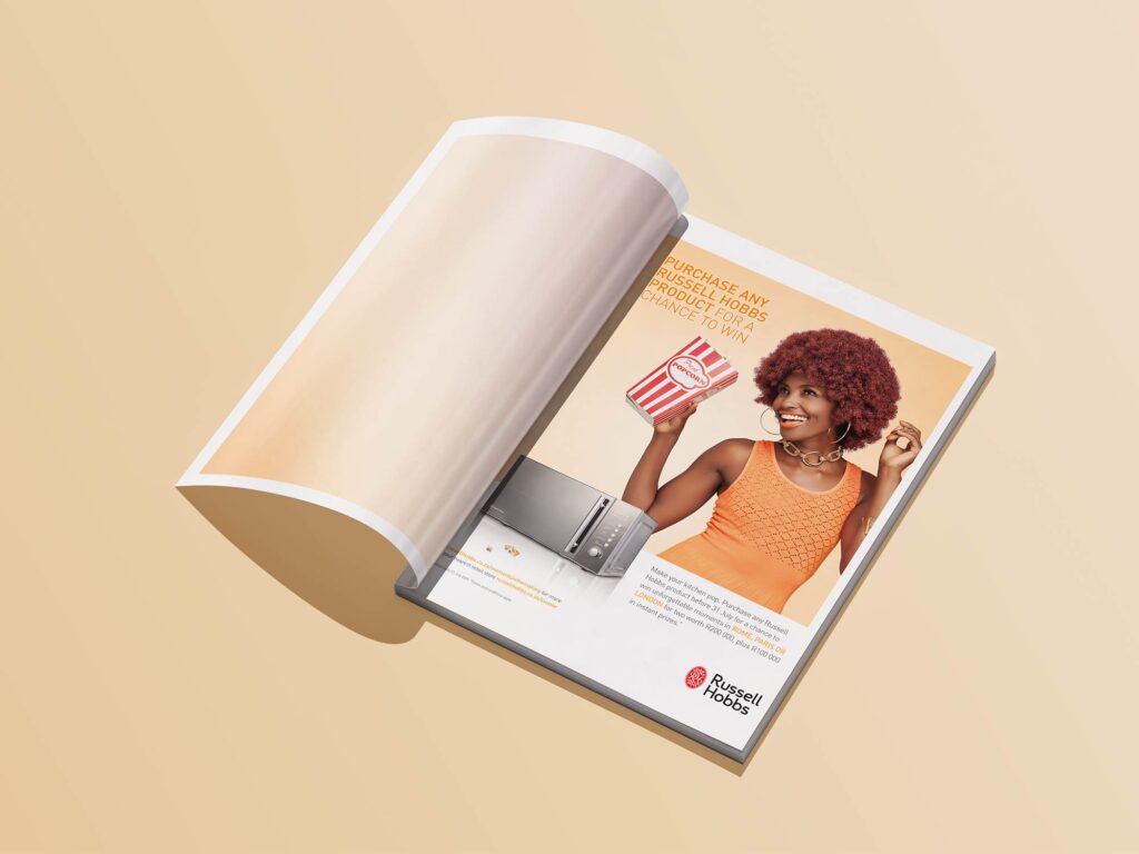
Russell Hobbs
Russell Hobbs

Sun International with Charlize Theron
Sun International with Charlize Theron
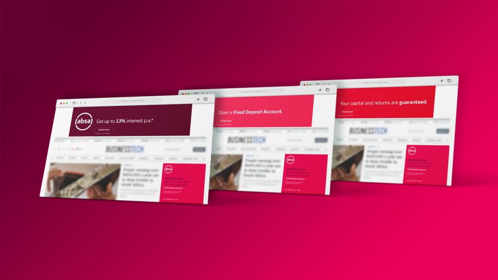
Absa Fixed Deposit
Absa Fixed Deposit
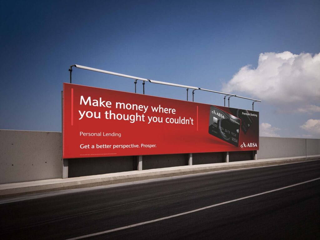
Absa Premium Banking
Absa Premium Banking
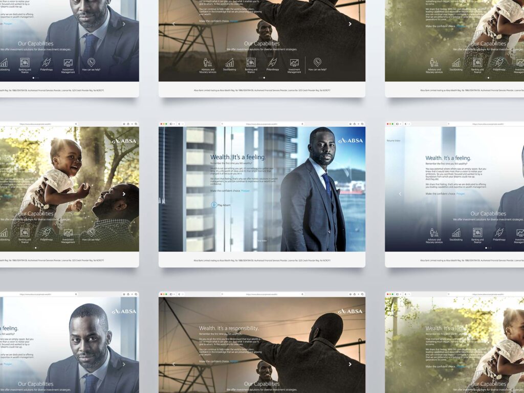
Absa Wealth